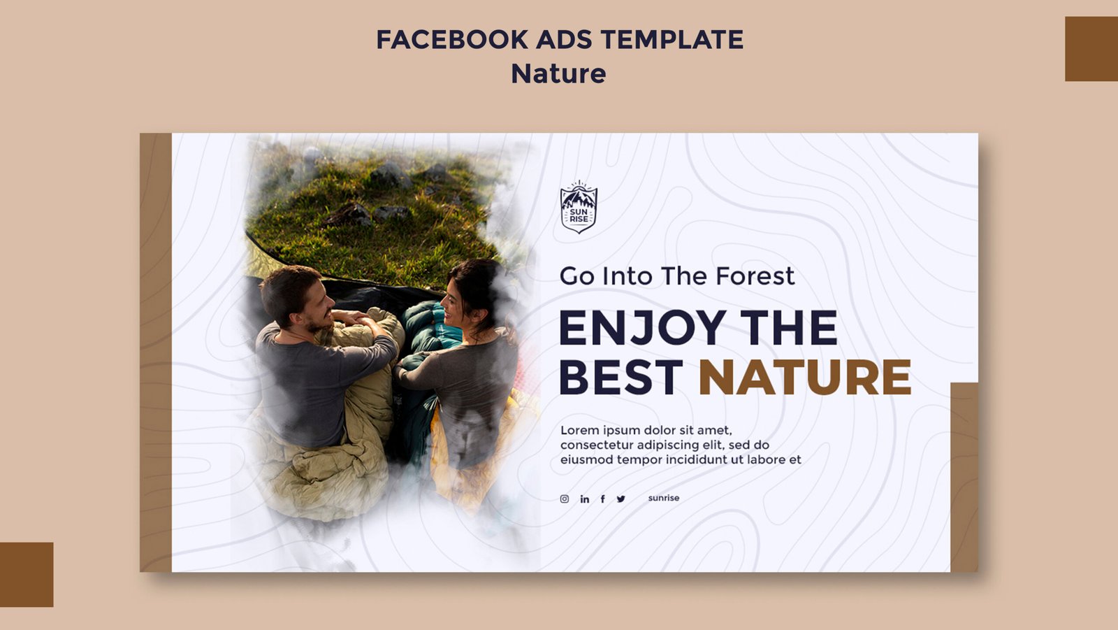
In the field of visual media, posters are an effective means for passing messages, advertising events and grabbing people’s attention. A perfectly designed printable poster offers the potential of creating product appeal, influencing people’s emotions and leaving a lasting impact at first sight.
This blog aims at providing guidelines on various styles of custom print posters that can assist graphic designers, marketers or anyone interested in the art of telling a story through a poster in an effective and efficient manner.
1. TYPOGRAPHY POSTERS
The Power of Words
Typography posters rely on the artistic display of words on material, in order to pass messages. These posters communicate principally the typographic aspects heading, size, heading and colour to have an effective influence. Since typography posters are based on the beautiful appearance of letters and words, they can be minimal yet aggressive at the same time.
Key Elements:
- Font Selection: Target those that would make people look twice; odd font choices will attract glances.
- Contrast: Experiment with the different types, sizes and styles to establish the structures.
- Colour: Employ bright hues on strategies that would establish a clear focus on the concepts.
- Alignment: Vary alignments and spacing keeping the balance and interest into consideration.
2. MINIMALIST POSTERS
Less is More
Posters that are minimal do not contain very much information in them and can be depicted easily. Minimalism is an effective way of conveying a lot with less; it basically describes the elegance and effectiveness of the design concept.
Key Elements:
- White Space: After researching, bring into focus the fact that there is a need to use a lot of white space in order to make emphasis on the main aspects.
- Simple Graphics: If the message is quite emphasised, it is recommended to deploy basic geometric forms and pictograms.
- Limited Colour Palette: Do not use too many colours especially loud ones, they make the picture look cluttered.
- Focus: Make sure the primary message and the picture is noticeable when compared to the rest of the design.
3. VINTAGE POSTERS
Nostalgia and Charm
Such concepts raise the aesthetic appeal of vintage posters through the use of design features associated with certain time periods. Whether the architecture of the 1920’s art deco style or the colourful patterns of the 1960’s, the viewers have a link.
Key Elements:
- Retro Fonts: Use fonts that are relevant to the specific time period that the movie is based upon the 80’s.
- Aged Textures: Use shading and distress effects that would give the feel of an aged look poster.
- Colour Schemes: It is important to select colours that would suit the given time period.
- Illustrations: Employ drawings typical for the specified period of time.
4. ILLUSTRATIVE POSTERS
Art in Motion
Posters of this type require importing or drawing custom artwork and illustrations, which in most cases is used to pass across a message or even tell a story. These posters are very artistic and can be very simple in design and just plain fun or elaborate to the point of near complexity in design depending on the designer.
Key Elements:
- Unique Art: Incorporate illustrations that are likely to draw a lot of attention from the readers.
- Colour and Detail: Give heed to colour selection and details.
- Narrative: Make sure that the illustration makes a clear statement that will engage the viewer. For example, check whether the illustration is telling a good story or passing the right message.
- Composition: Organise objects in a manner that brings harmony visually and brings the viewer’s attention to the detailing.
5. PHOTOGRAPHIC POSTERS
Capturing Reality
Photographic posters are large picture images. Normally the purpose of photographic posters is to capture attention due to their magnitude and the kind of image used. In most cases, these posters portray real-life subjects. For example, through a beautiful landscape, a beautiful face, or a beautiful message. Hence, the main ingredient to a successful photographic poster is picking the right picture.
Key Elements:
- High-Quality Images: Make high resolution for a clear and powerful picture.
- Composition: Take a note of the distribution of the photo and where it is placed inside the poster.
- Colour Correction: Sharpen the picture to improve the colours as well as details with the intent to make the picture pop.
- Text Integration: When text is included, make sure that it does not overshadow the main photo.
CONCLUSION
Print the best posters online with Copy Shop – The best place to print posters and enhance your digital image today!

